Welcome to the Hammer Hammburger.
You can check out
or feel free to reach out.
Want an actual hamburger?
Tell ‘em we sent you
New Business:
info@hammercreative.com Click to copy
HI-FI RUSH
Pop comic style syncs with a toe-tapping playlist in Tango Gamework’s/Bethesda’s instant hit.
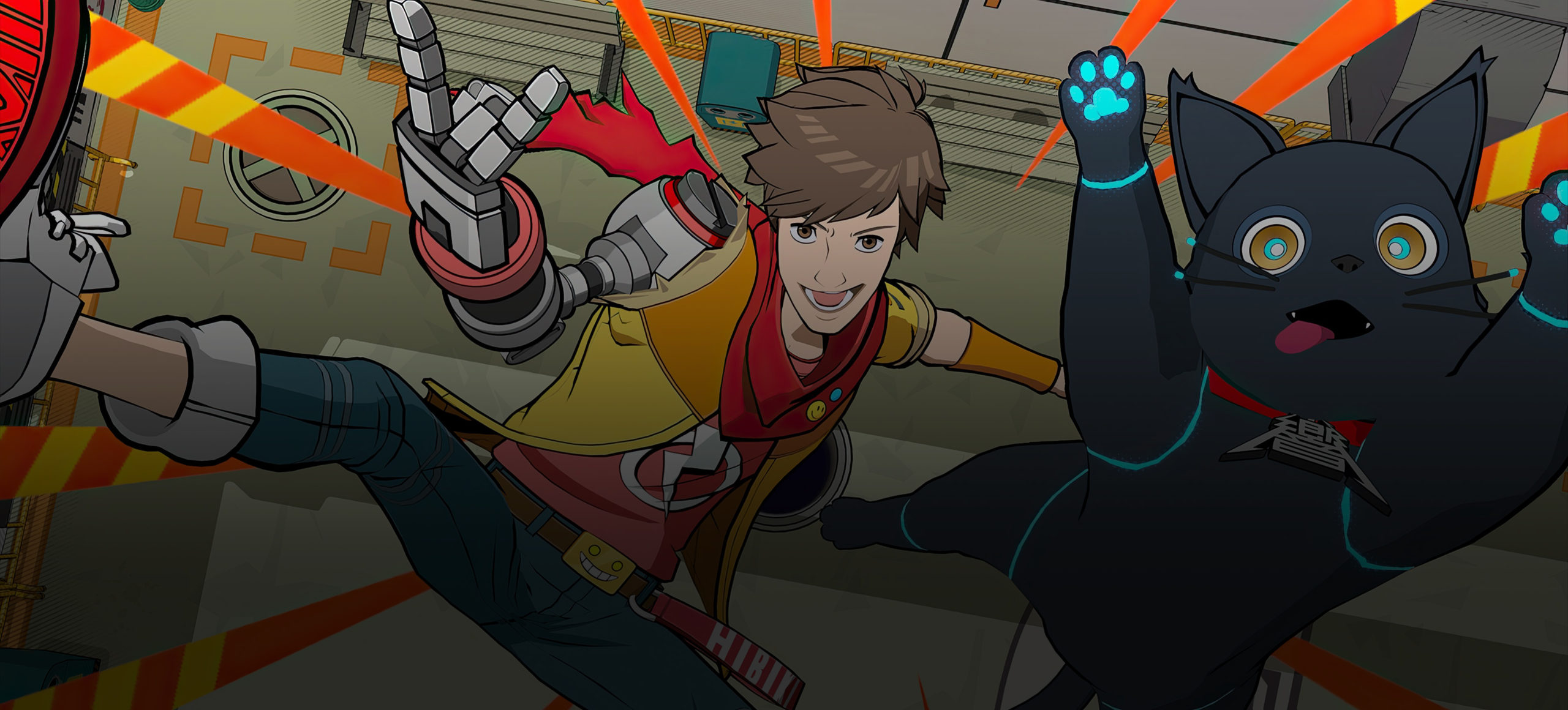
Delivered Elements:
Brand Identity
Announce/Launch Trailer
Logo
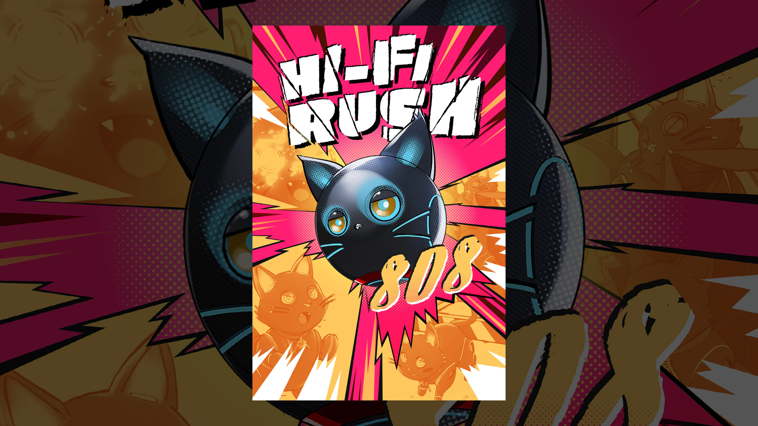
Key Art
Motion GFX Toolkit
Services:
Branding
Concepting & Script Development
Editorial
Game Capture
Visual Identity
Motion GFX Design & Animation
A/V Post Production
Naming (Game Title)
Voice & Messaging
Custom Animation via Unreal Engine
THE CHALLENGE:
CUT THROUGH THE NOISE
WITH A BOLD BRAND
IDENTITY, CREATIVE STRATEGY
& MIC-DROP LAUNCH
HI-FI RUSH is a rare gem in gaming. While most modern titles boast complex systems or daunting worlds, this game focuses on music-based gameplay that’s easy to get the hang of, and a joy to try and master. Dipped in vivid punk-rock-pop style, the game’s pickup-and-play simplicity felt like a key strength that we wanted to make sure was at the forefront of our campaign.
Using this insight as our guiding light, we set out to craft a holistic brand and visual identity fit for the game’s rockstar attitude, along with a strategic announce and launch plan that would turn heads and prove ourselves as the new kid on the block.
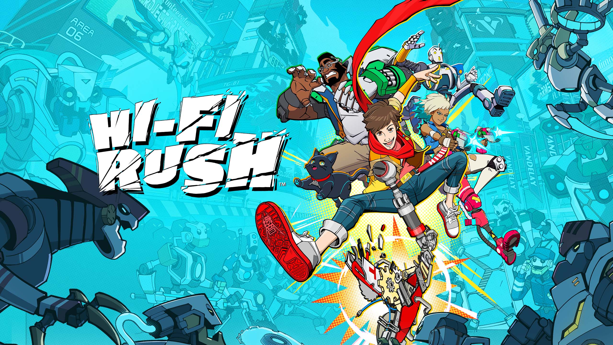
THE NAME OF THE GAME
Blending pop, alternative, and indie influences into a singular
identity can easily become a cacophony. Instead of mashing
genres, our creative and naming exploration honed
in on HI-FI RUSH’s feel-good, nostalgic take on music culture.
We went through every possible play on the word
“beat,” along with some ZUNE nods (R.I.P., old friend),
to land on a title that sounds as fun as the game is to play.
OUR DESIGN ETHOS
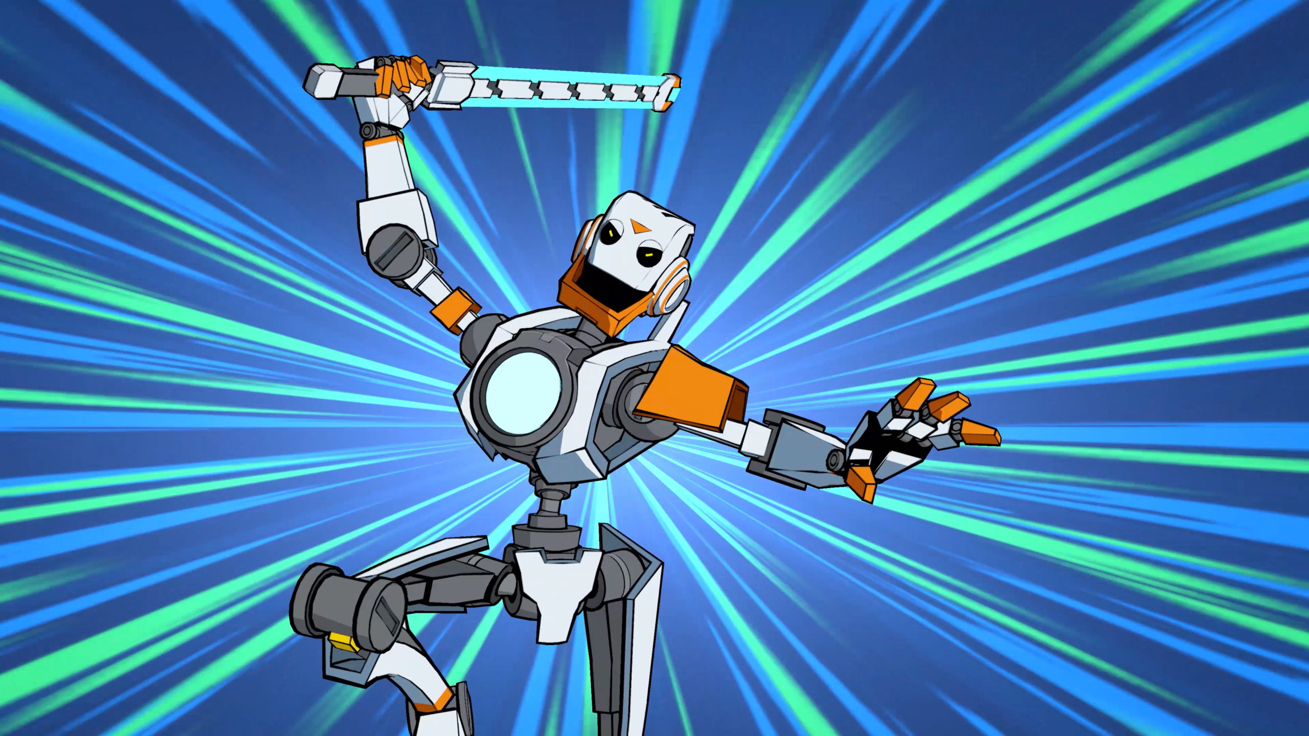
Action lines slice through the heavyweight logo to convey momentum and impact.
Half-tone patterns and pop color palettes showcase the Western comic-meets-Eastern manga influence.
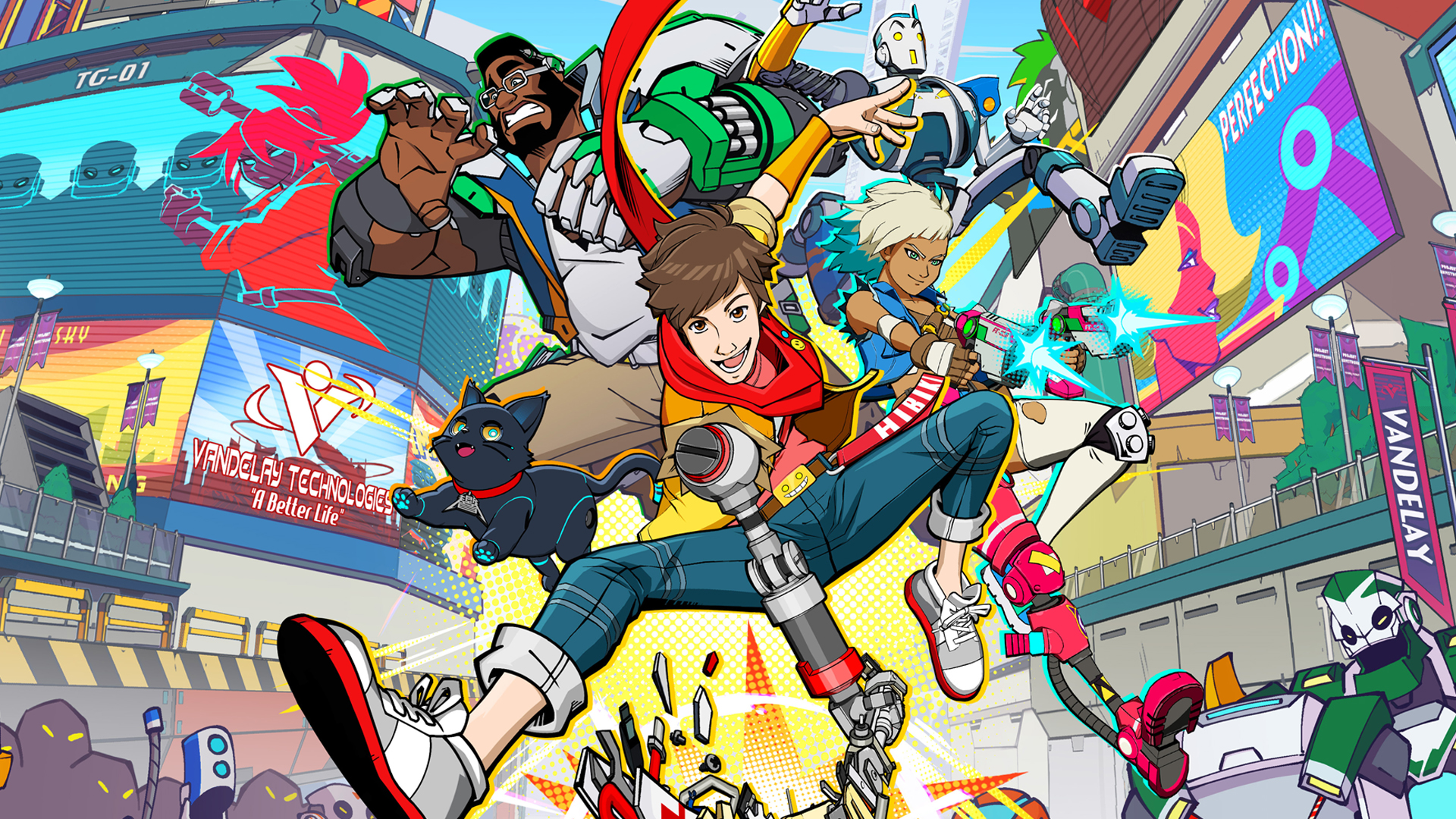
And lightning bolts. And cat stickers. HI-FI RUSH is unapologetically loud, and so is our Viz ID.
Of course, our brand’s visuals would not be complete without pulling inspiration from one of the game’s core components: MUSIC. HFR’s rockband nostalgia can be seen throughout our visual identity – from rock ‘n’ roll posters guiding the framing of our heroes in the Key Art, to fonts and motion graphics drawing from pop punk band logos.
A STANDOUT HEADLINER
While HI-FI-RUSH is a premium AAA experience, it has
the attitude of an indie game, and we wanted our marketing
and release strategy to reflect that – acting almost as the
antithesis to a traditional AAA marketing campaign. Cue a
“shadow drop,” with the game both announcing and releasing
on the same day at the Xbox Developer Direct showcase.
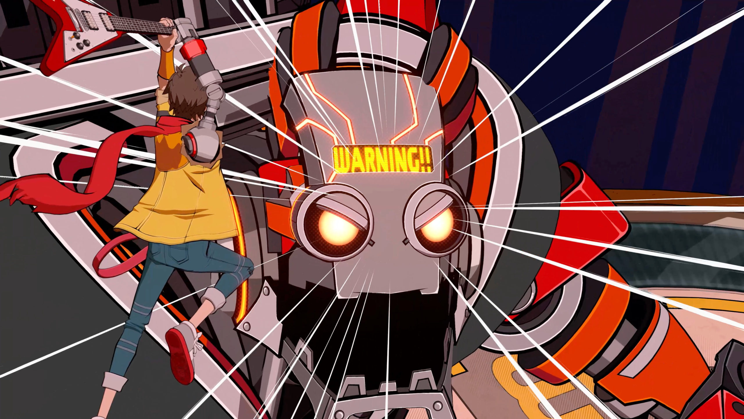
No long, drawn-out campaign. No gameplay walkthroughs with deep dives into mechanics or characters. Just a toe-tapping launch trailer packed with gameplay that immediately showed viewers what we knew they’d latch onto just as quickly as we did: the pure fun of playing the game.
HFR stole the show, and that’s no exaggeration: viewers flocked from the showcase’s live-stream to try it out for themselves, and has since been touted by both players and critics as not only the best game of the year, but one of the best marketing approaches of the decade.
“Hi-Fi Rush, a game built around the concept of pure joy, was notable last week for two things. One, it’s really, really good! And two, it achieved that rarest of video game feats: successful surprise release.” – Kotaku
“The game is actually a top seller
on Steam [just a day after it’s release],
despite being a high profile Xbox
Game Pass release”– Forbes
“No long, drawn-out preview cycle. Virtually zero marketing. Just a cool-looking game, executed well, and presented to enthusiasts, with word of mouth doing the rest.
It’s probably fair to say it outshined
the four other games that were
showcased beside it.” – Vice
Top 3 most talked about games of the event
Attracted over 3 million players shortly after its surprise release and sold 300,000 copies on Steam in the first month far above the average for AA games
